Dear Reader,
I became a graphic designer because I love looking at letterforms and playing with words.
It is still a delight (and a lot of work) to design my own books and magazines—I'm designing the next issue right now. (50 pages done so far, yay!) But with an established template, page design, aesthetic, and font choices already selected for the quarterly magazine and my Encyclopedia of Inspiration series, there isn't much room to experiment.
The designs for these publications have served me well; I think my magazine is quite recognizable due to its wordmark, masthead and cover design. This consistency has been integral to its longevity. Likewise, developing a distinct design for the volumes in the Encyclopedia makes the books even more collectible over time.
But I need some typographic playtime!
So recently, I brought out my collection of tactile type: rubber stamps, Letraset dry-transfer lettering, stencils, wood type, and other assorted treasures. I'm creating a "text" book: it's a sketchbook but with words and type. I'll share more about it in the weeks ahead.
After designing a few pages of UPPERCASE magazine on the computer, it is nice to take a break with some hands-on activity.
UPPERCASE SUBSCRIPTIONS
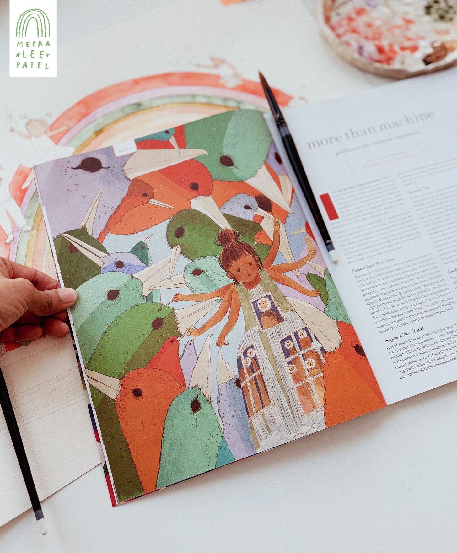
Subscriptions & Renewals: Use the code keepgoing for $10 (Canadian dollars) off a subscription or renewal. Start with issue #67 (stencils, black and white, contrasts) or issue #68 (illustration, the elements of creativity, and taking a stand against AI.)
quilted reprint
The Quilted reprint is at the printer. Preorders outside of North America are not available at this time. Once the reprint is ready (tentatively March), overseas customers will be able to purchase Quilted directly from UPPERCASE, and later from our UK distributor and stockists.